PSE Miami Website
Designing a responsive website for a business fraternity
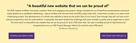
View website

MY ROLE
Research
Design
Develop
User-testing
PROJECT TYPE
Personal project
DURATION
5 weeks
TOOLS
Figma
Squarespace
HTML, CSS, Javasript
After not being updated and upkeeped for years, Miami University Pi Sigma Epsilon's website recognizes the importance of a website revamp to streamline the information seeking and application process, and compete with other business fraternities during recruitment season.
In this project, I was responsible for the entire website development process, from Research to Design implementation.
.png)
1 Week
2 Weeks
2 Weeks
Impact
PSE Miami post-redesign website received favorable results:
35%
Fall 2024
recruitment applications
22%
Website visits
9%
Overall page views
46%
Member portal visits
How much of the website needed to be redesigned?
To begin, I conducted a survey with the general members to determine their level of satisfaction and experience navigating the old website.
85%
SUPPORTS THE REDESIGN


Why are they dissatisfied?
Unorganized and outdated database
"Don't need to visit the site"
Broken links
"Too many pages"
Confusing layout
Unused features
Inconsistent language
Information is hard to find
Outdated design
Goals
Find the best way to communicate organization value to customers with the highest impact on
2 KPIs:

Recruitment applications
.png)
Website visits
What do we want to communicate?
Next, I discussed with the leadership board to align on the message and content we wanted to convey to audience.
WHAT
Value Proposition
Pi Sigma Epsilon is the nation’s only professional co-ed fraternity in the fields of Marketing and Sales
Mission Statement
To develop the sales, marketing, and professional skills of its members through experience and development.
Main Features
-
Professional development
-
Leadership opportunities
-
Hands-on client work
-
Exclusive access t companies and alumni network
TO WHOM?
People who are...
-
Interested in sales and marketing at Miami University
-
Wanting to join a business fraternity
-
General PSE members
-
PSE alumni
Businesses that...
-
Seek to enhance the value of their service and products
-
Build a brand reputation with college students
Re-establish website structure and style guide
After contextualizing the feedback and discussion, I created a new website sitemap and style guide that are more organized and aligned with PSE's branding.
SITEMAP
.png)
DESIGN GUIDE


Design highlights
Homepage
COMMUNICATE SERVICE TO TARGETED AUDIENCE
I dedicated the top section of the homepage to showcase my organization's point of difference, emphasizing the uniqueness that PSE has to offer from our competitors.


SHOWCASE CHAPTER'S BROTHERHOOD
It is hard to envision what it's like to be a PSE member. Therefore, I featured photos of members' involvement to help audience grasp a vision, inviting them to join.

Partners Page
BUILD TRUST AND CONSTANT CALL TO ACTIONS
I built trust with the businesses by featuring endorsements from past partners, highlighting the professional backgrounds of our chapter members.
Furthermore, I displayed brochures, case studies, and call to actions to streamline the information request process.


Member Portal
IMPROVE NAVIGATION
The redesign also aimed to facilitate the current members’ experience navigating the member portal, an exclusive resource with important information and links for members.
The most important links were prioritized to the top of the portal to ensure quick and easy access, including direct navigation with the search bar.
.png)
Additional member-focused resources such as applications and events were added to keep members immersed in the chapter.

Recruitment Pages
FEWER PAGES, GREATER IMPACT
I decreased the number of recruitment pages from 6 to 4: Why PSE, New Member Experience, Resources, and FAQ.
These pages contain important recruitment information such as the six-week new member process, recruitment events schedule, and the application.


Key Takeaways
Accounting for different screen sizes during design and development
Designing for multiple screen sizes means making sure interactive features work well on all devices. For instance, a button that’s easy to click with a mouse on a desktop might be too small for someone to tap on a phone. Hover-based micro-animations may also not translate smoothly to mobile taps. Additionally, while large, high-quality images can look great on desktop, they may negatively affect loading speed on mobile devices.
Don't overestimate my coding capabilities
Utilizing Squarespace, a low-code website builder, significantly reduced development time. However, the platform has certain limitations. For example, changing the background color of a section required locating the block ID and inserting custom CSS into the designated area. Additionally, certain design elements exceeded my current coding capabilities, which led to last-minute adjustments in order to meet the project deadline. In the future, assessing the feasibility of design concepts in advance will help conserve both time and effort.